Andrew's Blog
CSS Positioning
Upload Date: 7th September 2020
CSS (Cascading Style Sheet) is a great tool to use for not just adding styles to your boring old html, but also for positioning your contents in such a way that they are easier to engage with and navigate around. Unfortunately with CSS, you cannot simply drag and drop elements on the HTML as you see fit. However, you can apply different sets of rules to help the contents of the page organise themselves to your liking. There are many sets of those rules and the one we will be visiting this time is the “CSS Positioning”.
Before we jump the boat…
Step 0 we should take before going into CSS positioning is to look at how the elements on a webpage are presented. All elements are blocks of rectangular blocks with its own pixels of borders and margins.
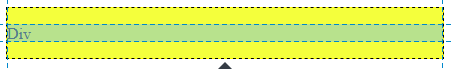
Figure 1
There are elements such as div that are display: block by default (meaning they don’t jump next to other elements and share the row), and there are elements such as span that are display: inline by default and will sit horizontally next to other elements.
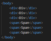
Figure 2
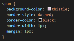
Figure 3
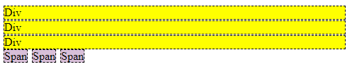
Figure 4
Now we understand that each element has their own boxes of space that they fill up on a webpage, now let’s have a look at their types of positioning.
Static Positioning
The static positioning is the default positioning for the elements. It is sometimes used to change the element’s positioning back to default when it's affected by the outside elements. The html syntax for assigning a static position is position: static
Relative Positioning
What if I want to move this element 10px to the right from where it is now? Relative positioning answers that question for you. It allows you to move the element in relation to where it would be if it was position: static , which should be the default position from the start.
Figure 5 shows "Div one" element with position: relative. Figure 6 shows "Div one" element with position: relative with left: 15px.
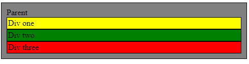
Figure 5
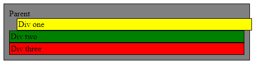
Figure 6
Another effect the relative positioning will have on its element is that it will always appear on top of another static positioned element if moved over.
You can also set it so that it appears on top or under other elements with different positionings using the z-index. Assigning a higher z-index to an element that does not have a static position will allow it to be positioned higher than the those with lower assigned z-index.
Figure 7 shows "Div one" with position: relative with top: 15px. You can see the relatively positioned "Div One" allows it to position itself on top of the "Dive two" with static position
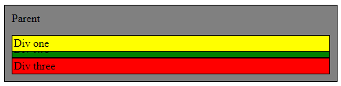
Figure 7
Absolute Positioning
What if you wanted to position something, wherever you wanted, without affecting positions of other elements? Absolute positioning allows you to place an element anywhere within its parent as if it is a sticker, given that the parent element is either relatively or absolutely positioned. If there are no parent elements with absolute or relative positioning, it positions itself in relation to the html instead.
Figure 8 shows “Div one” with position: absolute . Notice how it is positioned on top of other elements without affecting their position.
Figure 9 shows absolutely positioned “Div one” with top: 15px; while the “Parent” division is relatively positioned. Notice how it is positioned 15px from the top in relation to the “parent” division without affecting any other elements.
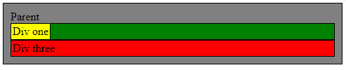
Figure 8
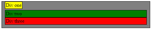
Figure 9
Figure 10 shows absolutely positioned “Div one” with top: 15px; while the “Parent” division is neither relatively positioned or absolutely positioned. Notice how it is positioned 15px from the top in relation to the html without affecting any other elements.
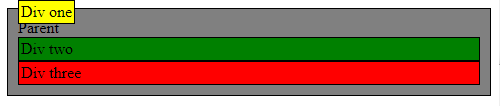
Figure 10
Fixed Positioning
Very similar to absolute positioning, except that it is always positioned in relation to the viewport. Because the viewport doesn’t move or change when the window is scrolled, it also means the position:fixed allows elements to not move when the window is scrolled. This characteristic makes it useful for positioning nav bars.
Figure 11 shows “Div one” with a fixed position with top: 0px. The “Parent” element is positioned relatively but unlike absolute positioning, it is fixed only to the viewport.
Figure 12 shows how scrolling the window does not change the position of the “Div one” element while it is in fixed position.
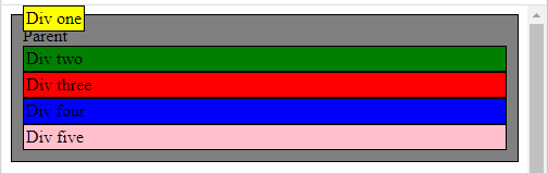
Figure 11
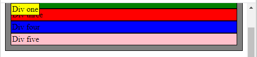
Figure 12
Sticky Positioning
Position: sticky is like a fixed position where the element is placed like a static positioned element until it has been scrolled past. Given that the parent element has extra room, the sticky element will behave as a fixed positioned element.